Landscaping is about creating spaces that influence how people feel and interact with their surroundings. Color plays a pivotal role in shaping mood, perception, and even behavior in outdoor environments. By understanding the psychology of colors, homeowners and landscape designers can create gardens and outdoor spaces that evoke specific emotions, from calm and relaxation to energy and excitement. This blog explores how to strategically choose plants, flowers, and materials to achieve a high end, emotionally impactful landscape.
Understanding Color Psychology in Landscaping
Colors influence human emotions on a subconscious level. In landscaping, warm colors like red, orange, and yellow can energize a space, making it feel vibrant and inviting. In contrast, cool colors such as blue, purple, and green promote relaxation, calm, and tranquility. The intensity and saturation of colors also affect perception: vibrant hues attract attention and create focal points, while muted tones add sophistication and harmony. Properly combining colors with textures, materials, and plant selection can transform an ordinary garden into a luxurious retreat.
Warm Colors and Their Impact
Colors play a crucial role in landscaping, shaping the mood and atmosphere of outdoor spaces. Warm colors such as red, orange, and yellow are particularly effective in creating vibrancy, energy, and engagement. Red, for instance, is bold, passionate, and naturally draws attention, making it ideal for highlighting focal points like seating areas, pergolas, or garden pathways. Incorporating red flowers such as roses, hibiscus, or tulips can instantly add a sense of sophistication and liveliness, especially in social zones where interaction and activity are encouraged. By using red strategically alongside other tones, it is possible to create a high-end, luxurious look without overwhelming the overall design.
Similarly, orange and yellow flowers, like marigolds, lantanas, and orange lilies, bring warmth and cheerfulness to the garden. Orange evokes creativity and excitement, while yellow symbolizes happiness and optimism. Placing these plants near patios, outdoor dining areas, or entertainment zones can make spaces feel inviting and vibrant. The careful use of bright warm tones ensures that the garden feels lively and welcoming without appearing cluttered or overstimulating.
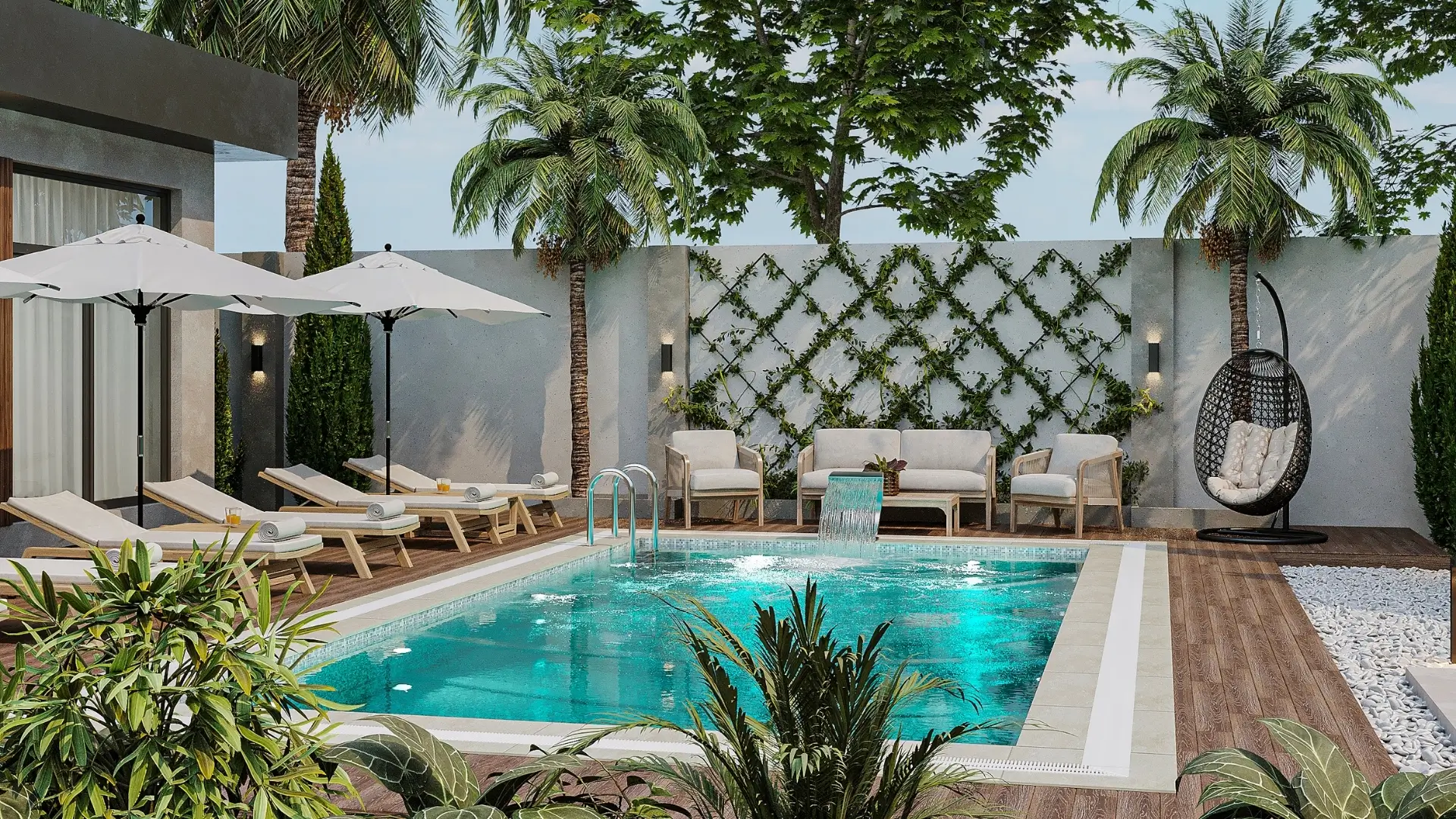
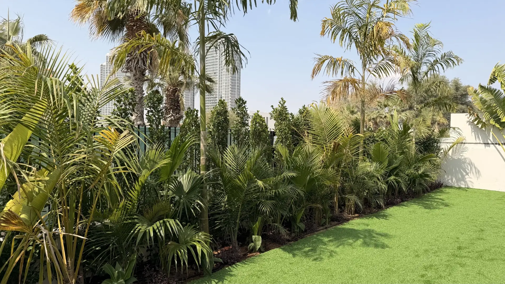
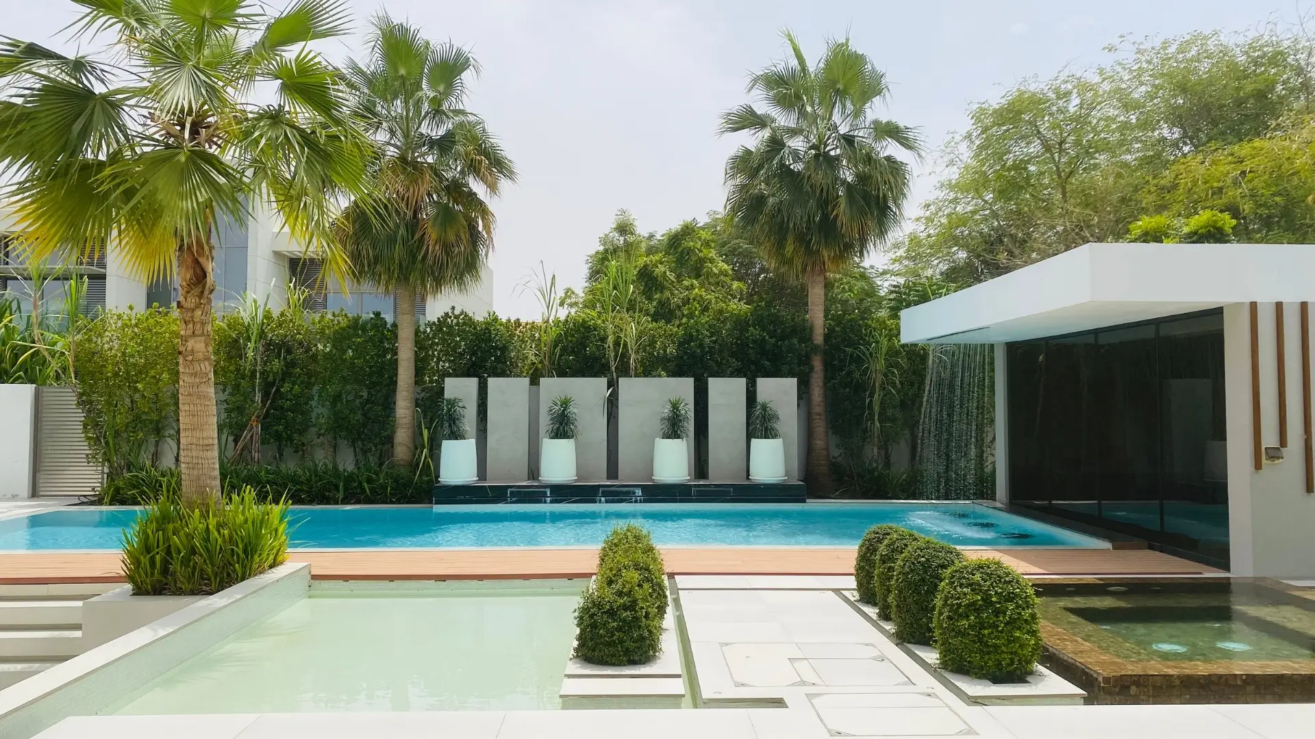
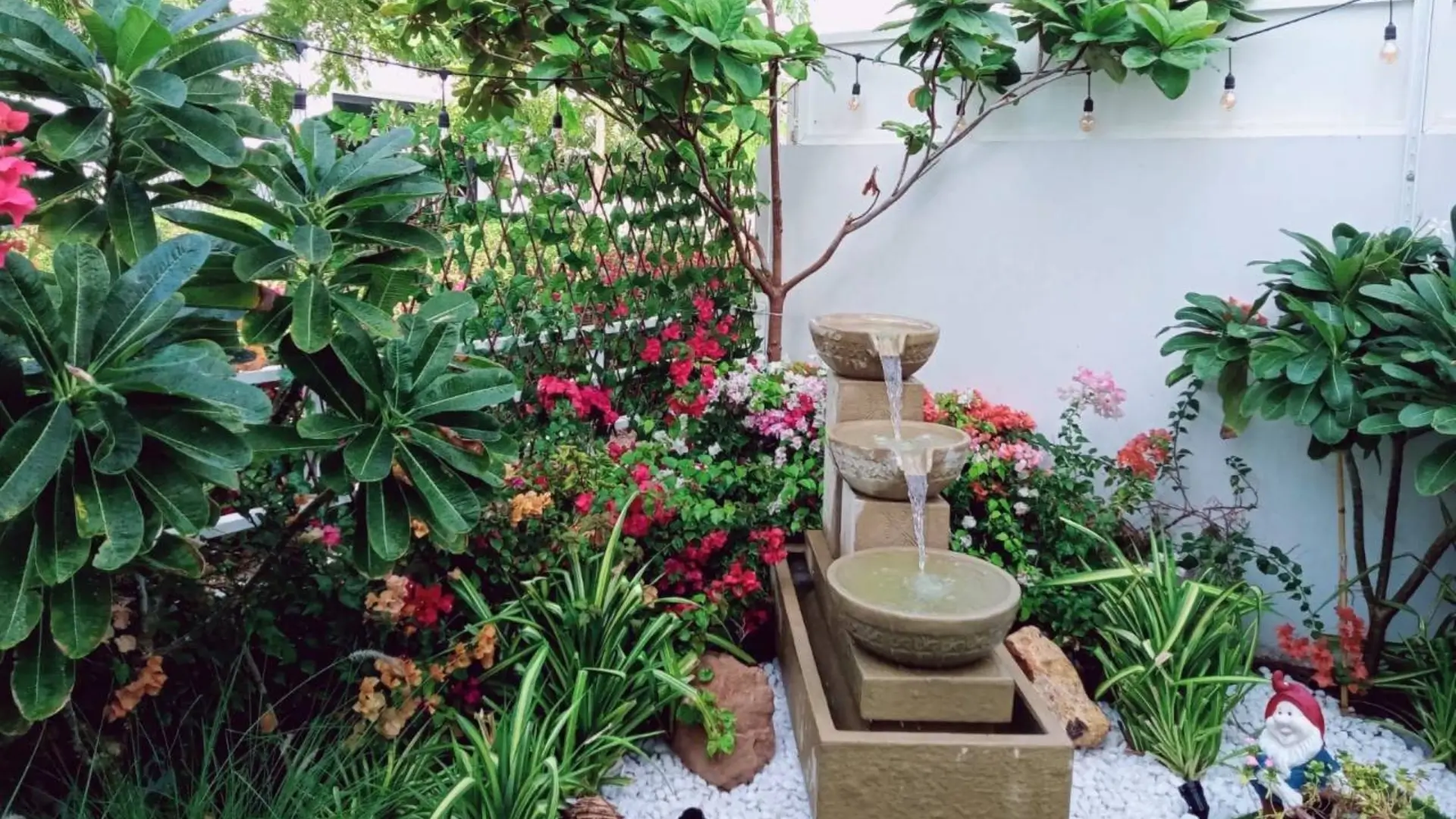
In contrast, cool colors such as green, blue, and purple create a calming, serene environment. Green, the most abundant color in nature, is inherently soothing, and using a variety of shades and textures, such as ferns, hostas, and ornamental grasses, adds depth and richness to any landscape. Blue flowers like hydrangeas and delphiniums evoke tranquility, while purple flowers such as lavender and salvia bring a touch of luxury and creativity. These colors work particularly well in meditation corners, private seating areas, or near water features, offering a peaceful retreat from the busyness of daily life.
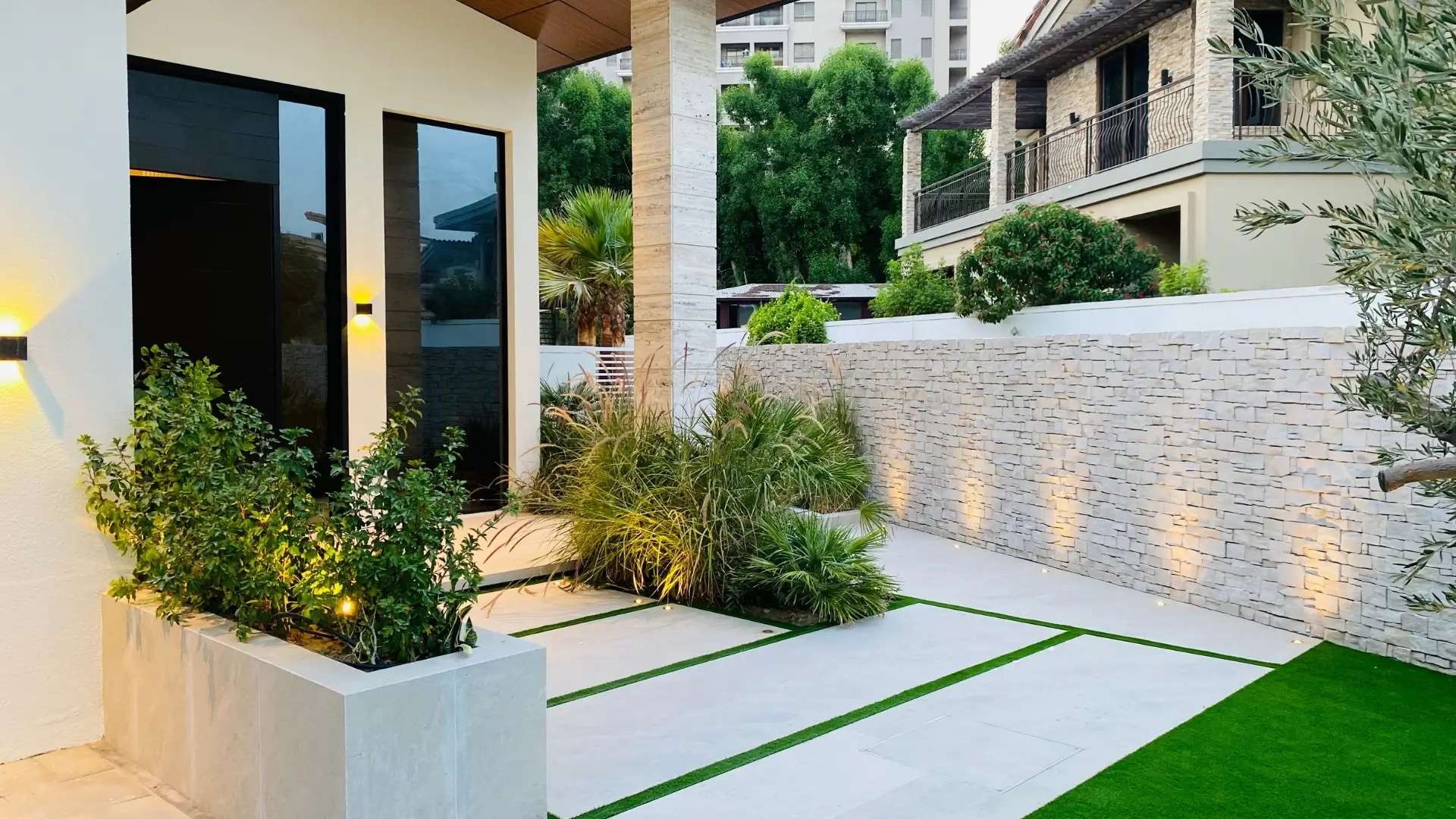
White and neutral tones, including cream colored stones, light decking, and white flowers, provide elegance and visual harmony. They complement both warm and cool colors, creating a sense of openness and sophistication. Incorporating neutral tones in furniture, paving, and décor helps maintain cohesion, ensuring that the garden feels polished and high end without requiring excessive investment. By balancing warm, cool, and neutral shades, homeowners can design outdoor spaces that are visually stunning while also influencing mood, energy, and relaxation.
Seasonal Colors and Mood
Landscapes change with the seasons, and strategically selecting plants can maintain visual interest year round:
- Spring: Bright, fresh colors symbolize renewal and growth. Tulips, daffodils, and cherry blossoms are ideal.
- Summer: Warm, bold tones energize outdoor spaces for entertaining. Sunflowers, marigolds, and zinnias create vibrancy.
- Autumn: Deep reds, oranges, and yellows provide warmth and reflection. Maples and chrysanthemums are popular.
- Winter: Evergreen plants and muted tones maintain serenity while providing structure to gardens during dormant months.
Choosing Plants Based on Mood Goals
When designing a garden, the selection of plants should go beyond aesthetics and align with the emotional experience you want to create in each space. For areas intended to be lively and social, incorporating plants with vibrant red, orange, and yellow tones can energize the environment and encourage interaction. Bold flowers such as roses, marigolds, or tulips naturally draw attention and make seating areas, patios, or entertainment zones feel dynamic and engaging. These warm hues are particularly effective in spaces designed for gatherings, parties, or outdoor dining, creating an inviting and stimulating atmosphere.
For calming retreats or private corners of a garden, cooler tones like green, blue, and purple promote relaxation and tranquility. Layered greenery, ornamental grasses, and blue hydrangeas or delphiniums can transform meditation spaces, reading nooks, or water feature areas into serene escapes from the stresses of daily life. Purple flowers, such as lavender or salvia, add a touch of elegance and luxury, making these areas feel refined and peaceful.
Romantic garden zones benefit from softer shades such as pinks, whites, and lavenders. These delicate colors, paired with strategically arranged plants of varying height and texture, create intimate, dreamy settings ideal for quiet reflection or special moments. By carefully balancing color, texture, and placement, a garden can feel both luxurious and emotionally impactful, providing tailored experiences throughout the outdoor space.
Hardscape Materials and Color Psychology
Color in landscaping isn’t limited to plants. Materials like stone, wood, decking, and fencing significantly influence perception:
- Stone and concrete: Light colored or textured stones add elegance, while darker materials provide contrast.
- Wood and composite decking: Warm wooden tones make outdoor areas inviting, while modern composite alternatives offer durability and design flexibility.
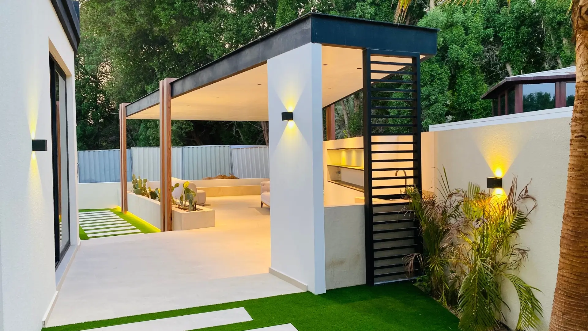
- Furniture and décor: Neutral furniture colors with colorful cushions complement plant palettes, creating cohesion.
Choosing materials that harmonize with plant colors reinforces the intended mood and adds a premium feel to the landscape.
Lighting and Color Perception
Lighting can enhance the emotional impact of colors in landscaping. Natural sunlight highlights the vibrancy of flowers and foliage, while strategically placed artificial lighting accentuates textures and focal points.
- Pathway lights improve safety and guide attention.
- Accent lighting highlights sculptures, water features, or statement plants.
- Ambient lighting around seating areas creates cozy, luxurious spaces.
Modern energy efficient LED and solar lights ensure long term beauty without increasing costs.
Creating Color Harmony and Contrast
Creating color harmony and contrast is essential for designing a garden that feels polished and visually appealing rather than chaotic. One effective approach is a monochromatic scheme, which uses varying shades of a single color to achieve sophistication and subtle elegance. This technique allows depth and interest without overwhelming the eye. Another strategy is to incorporate complementary colors, those located opposite each other on the color wheel, such as purple and yellow. Using complementary tones strategically adds vibrant contrast and draws attention to focal points like flower beds, pathways, or seating areas.
Analogous color schemes, which use colors positioned next to each other on the color wheel, provide smooth transitions and a sense of natural harmony. By thoughtfully layering colors alongside textures and materials, homeowners can create a cohesive, high-end look. Proper planning of color relationships ensures the garden feels balanced, luxurious, and emotionally engaging while maintaining visual flow throughout the outdoor space.
DIY Tips for Using Color in Landscaping
One of the first steps is to plan a color palette before purchasing plants or materials. Deciding on a combination of warm, cool, and neutral tones ensures that every element in the garden complements the overall design and creates the desired mood. Mixing perennials and seasonal plants helps maintain vibrancy throughout the year, ensuring the garden looks lush and inviting in every season.
For homeowners working with limited budgets, incorporating affordable alternatives like artificial turf, composite decking, or reclaimed stones can add texture and contrast while complementing plant colors. Additionally, using statement features such as bold water fountains, sculptures, or elegant pergolas can amplify the visual impact of the chosen palette. With careful planning and creativity, even modest gardens can achieve a sophisticated, high-end appearance, combining color, texture, and design to create a truly captivating outdoor space.
Common Mistakes to Avoid
- Overloading a garden with too many colors creates visual chaos.
- Ignoring seasonal changes can lead to dull or empty spaces.
- Selecting plants based solely on trends rather than emotional goals may compromise the desired mood.
Crafting Outdoor Retreats That Balance Beauty and Emotion
Color is a powerful tool in landscaping that goes beyond aesthetics. By understanding the psychology of colors, homeowners can create gardens and outdoor spaces that influence mood, promote relaxation, and energize social areas. Combining thoughtful plant selection, color coordinated materials, strategic lighting, and seasonal planning results in a cohesive, luxurious, and emotionally engaging landscape.
At Warriors Landscape, we specialize in designing gardens that balance beauty, functionality, and emotional impact, ensuring every outdoor space feels like a high end retreat tailored to your lifestyle and mood goals.